"Eyeball Ergonomics"
Somewhere along the line, radio automation designers lost track of the fact that broadcasters have to stare at their automation screens for hours-on-end. The result has been every possible misadventure into designs that are literally PAINFUL to look at. They're either way too dark, way too bright, or a disastrous combination of the two. In some cases, automation designers have tried to appeal to old equipment sensibilities by using "looks like the real thing" skeuomorphic designs, with equally unpleasant results.
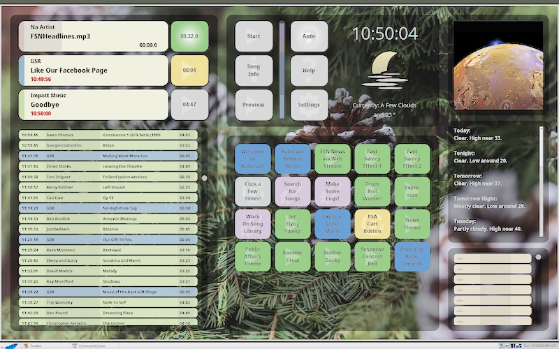
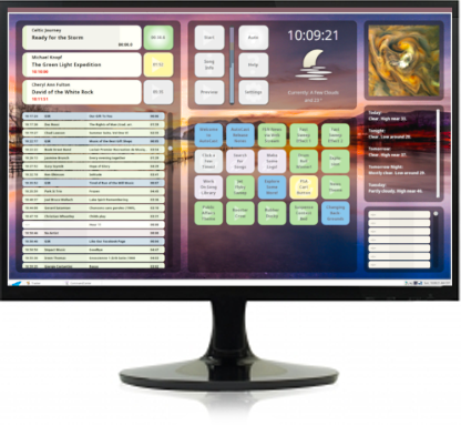
We decided to follow a different path, making our AutoCast interface not only easy on the eyes, but customizable to your particular set of orbs. The interface is semi-transparent, allowing you to "paint" your own experience by choosing any of the 300 supplied backgrounds (some shown below). As you drop an image onto AutoCast, it is immediately made the background.
One more thing
As you look through the gallery, notice that the operating system's desktop background color is different in each. That's because AutoCast performs a little extra magic each time you drop in a new photo. It uses "bit averaging" to find a complementary color, and changes your desktop to match!
Let's go for a scroll through the gallery. And we start our gallery tour with coffee, the best way to start pretty much anything…
Specialty - Java!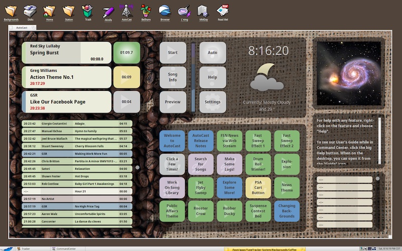
Nature - Mountains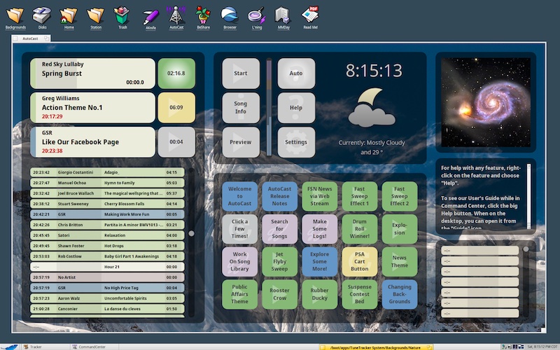
Nature - Lake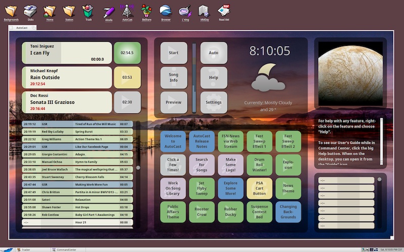
Nature - Berries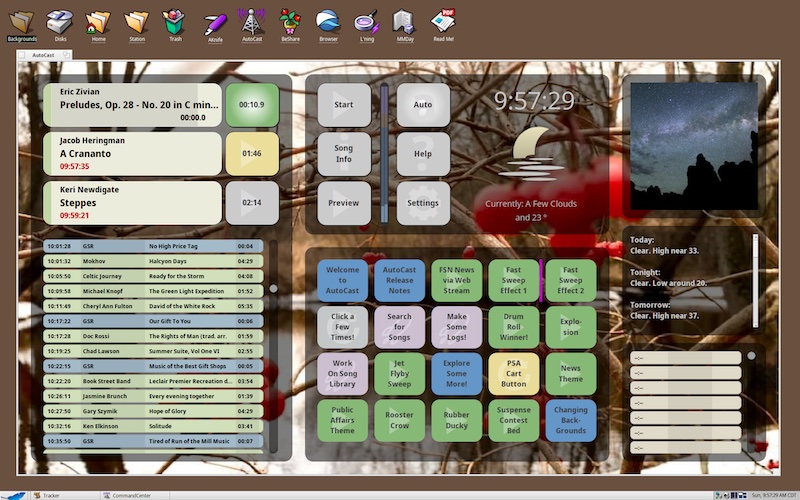
Seasons - Summer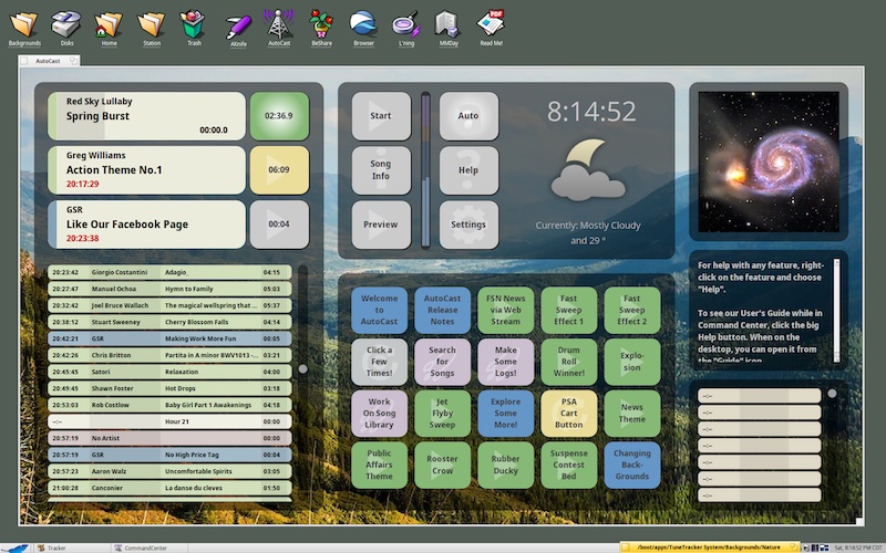
Seasons - Winter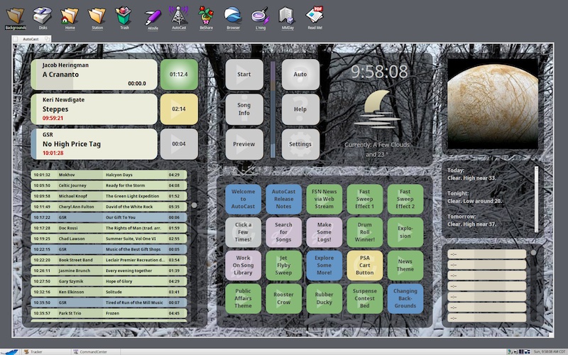
Seasons - Fall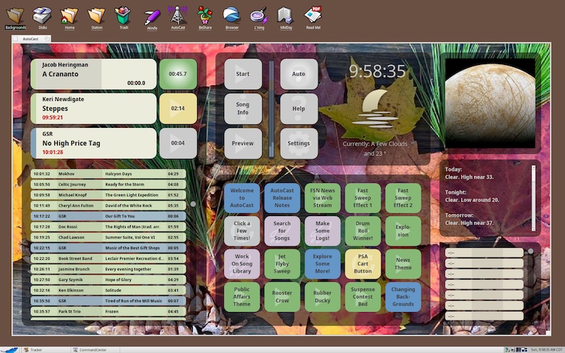
Space - Nebula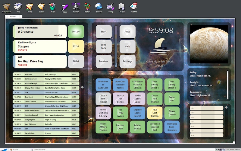
Space - Earth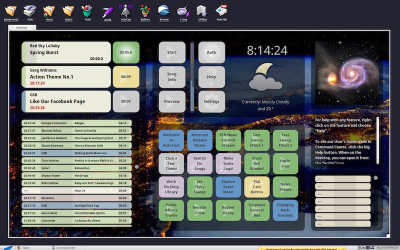
Space - Stars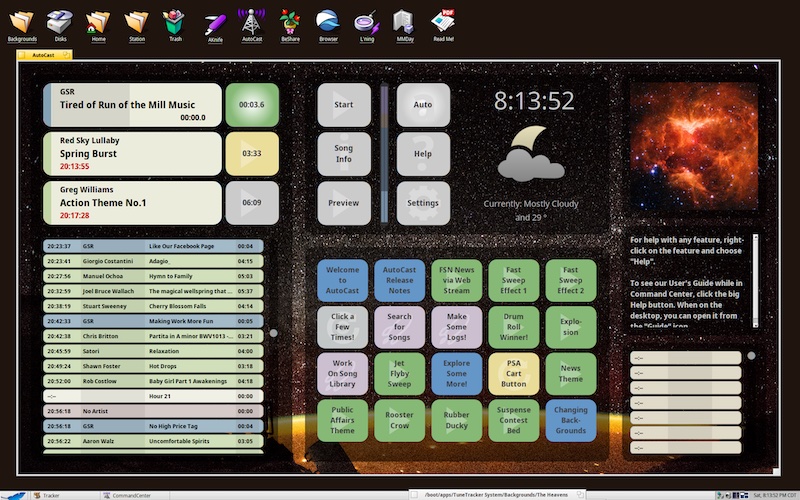
Bold - Red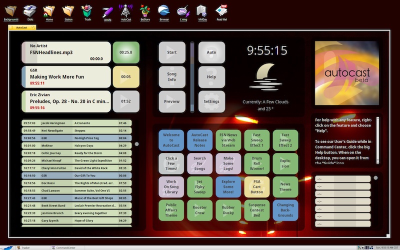
Bold - Splashy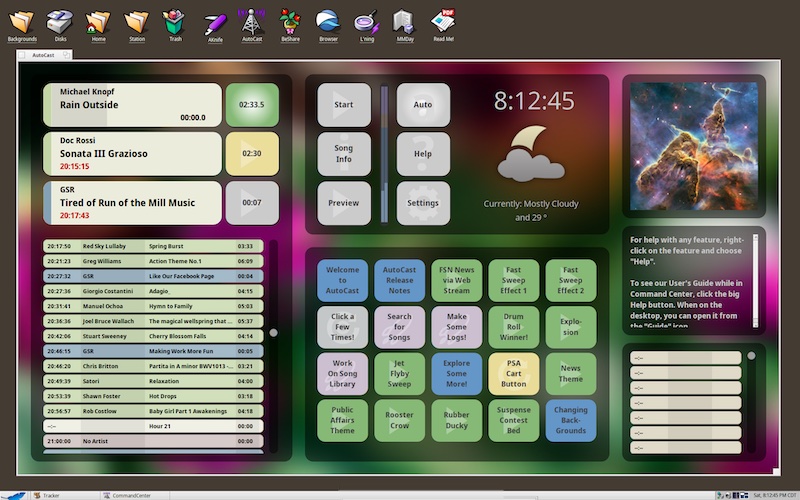
Bold - Blazing!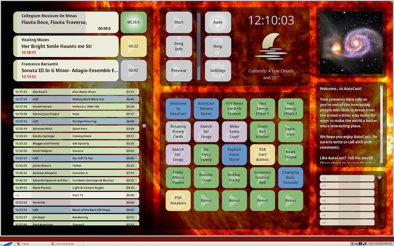
Blur 01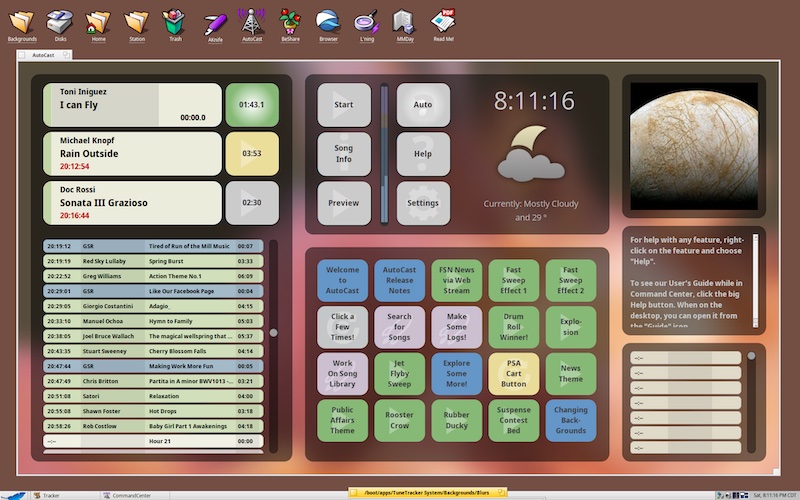
Blur 02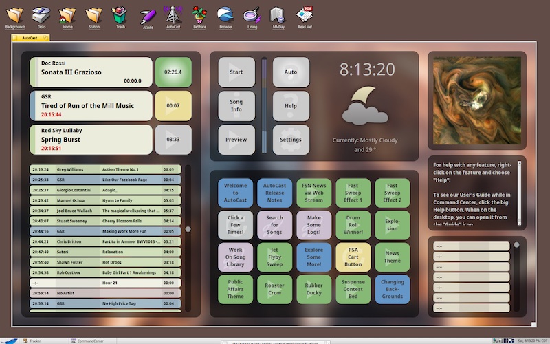
Specialty - Christmas